Duration
6 months
I led the design of this project which resulted in a 30% increase in user payment completion rates and over 200% Annual Recurring Revenue (ARR) for healthcare providers.
Overview
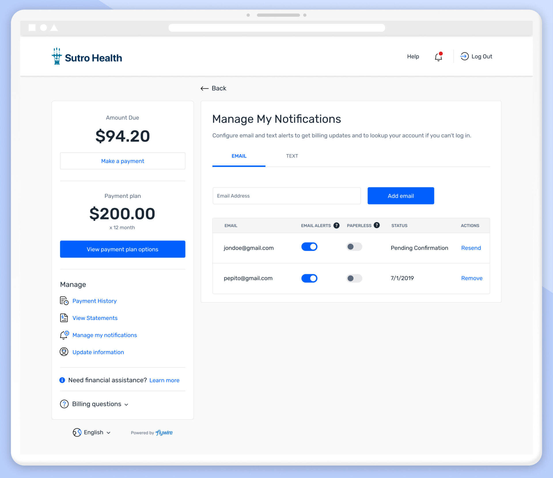
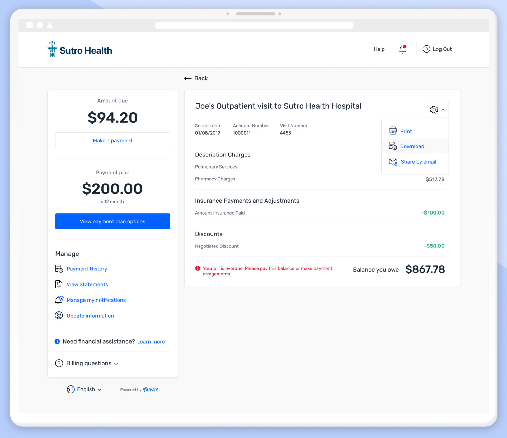
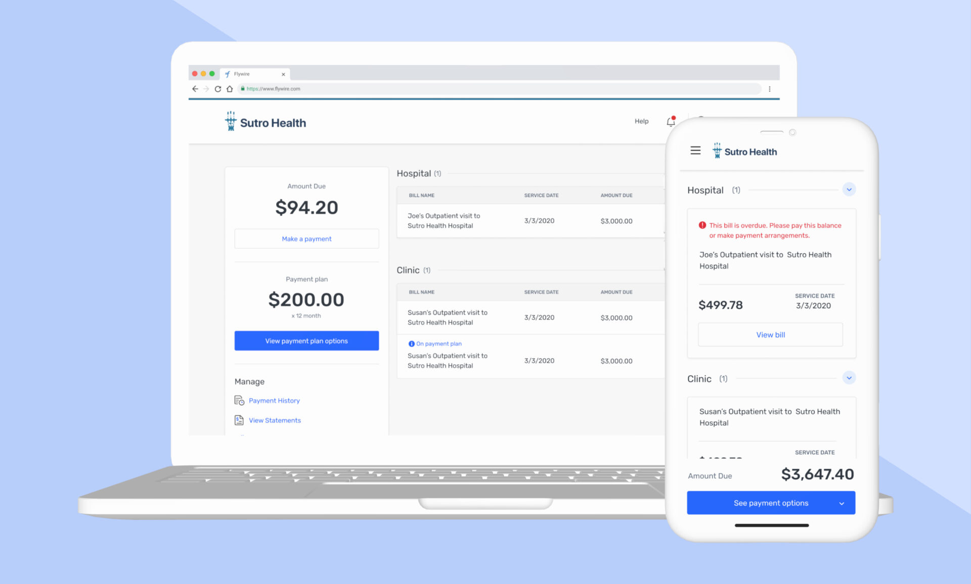
The Flywire Patient Experience is a consumer facing portal for patients to manage and pay their bills.
This is a white-label platform sold to healthcare providers as a portal for their users. Notifications, personal information, and insurance are all managed here.
When I began this project, the existing product had a very low conversion rate of around 30% completion, from initial engagement to payment receipt.
Opportunities for Improvement
Many pages used different styles of the same type of element leading to confusion.
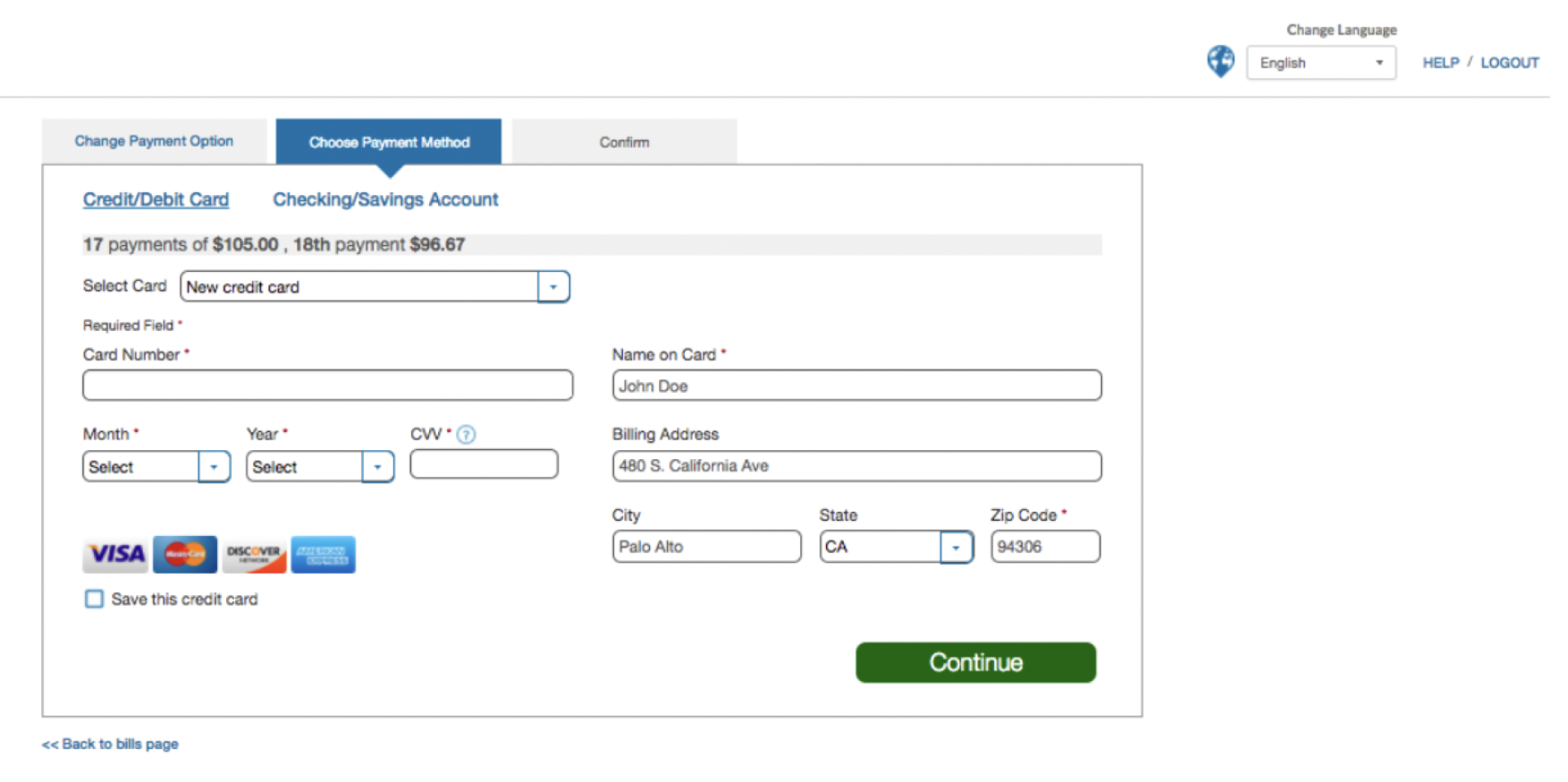
This layout also did not scale well with multiple payment methods.
The dashboard was lacking visual hierarchy, with no easily apparent call-to-action .There was also a lot of visual clutter.
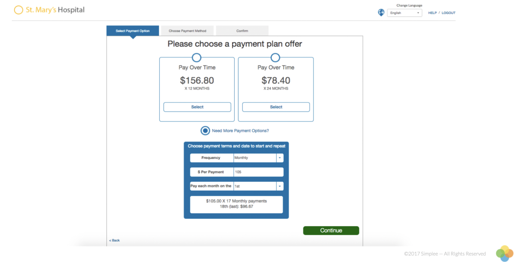
The layout of payment options was overwhelming users with information and causing decision shock.
This design did not scale well on mobile.
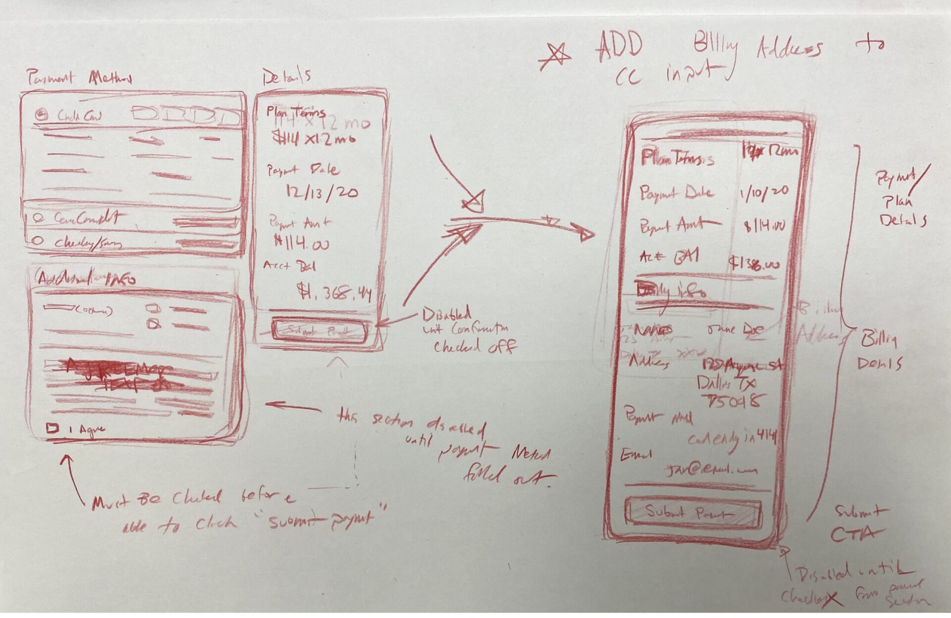
Process
I led usability tests with healthcare patients, gathering valuable qualitative data and edge cases.
Additionally, I employed the use of analytics tools including MixedPanel to do a deepdive on potential painpoints and dropoff points in the existing user experience.
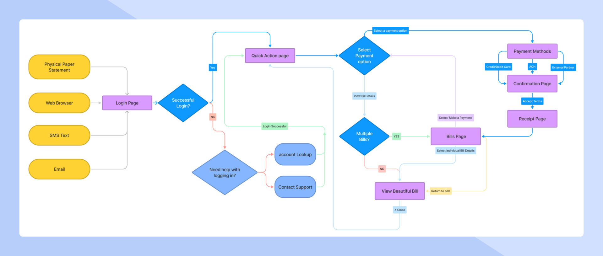
Flow diagram of the exisiting UX
Exploration
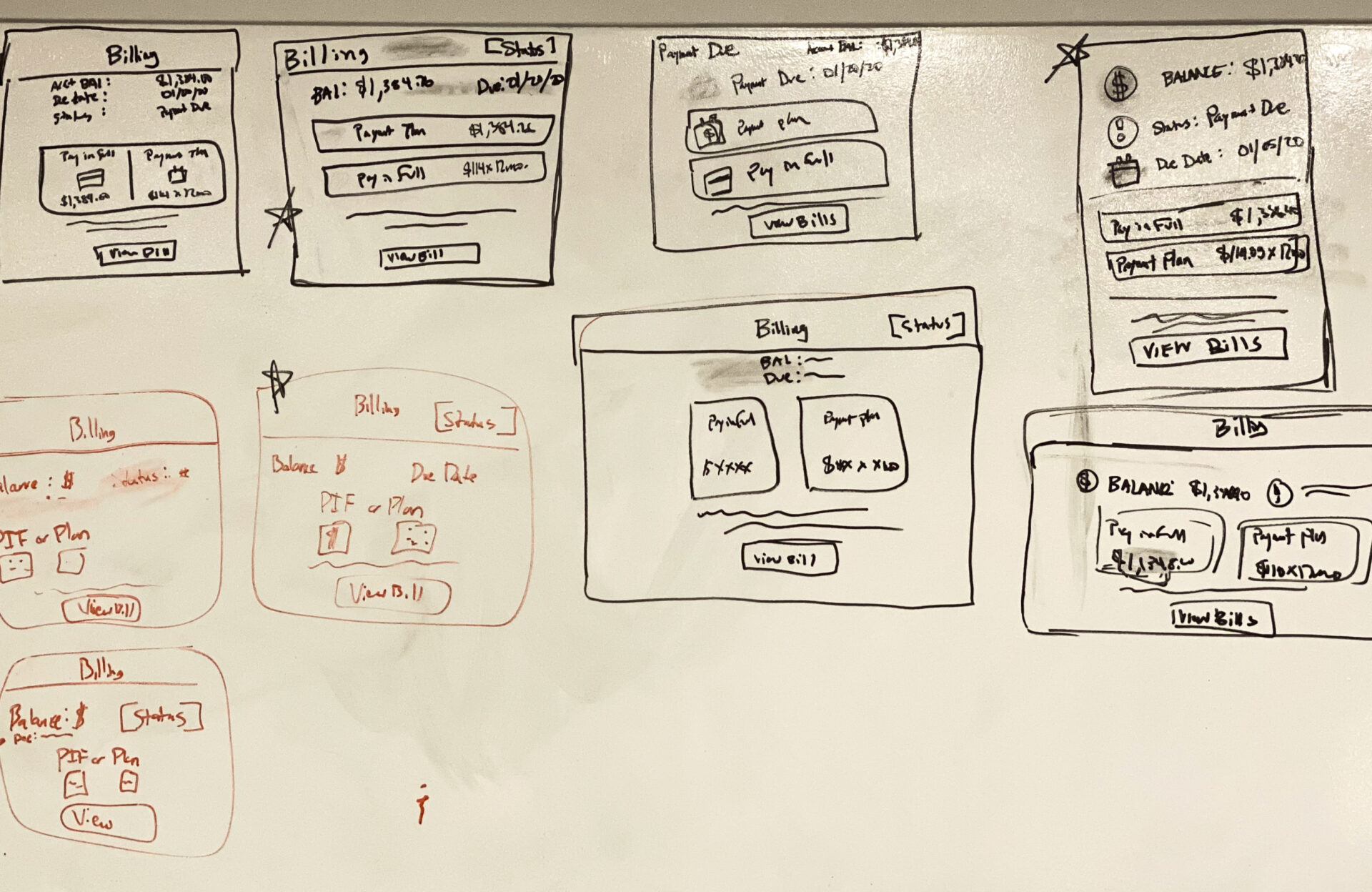
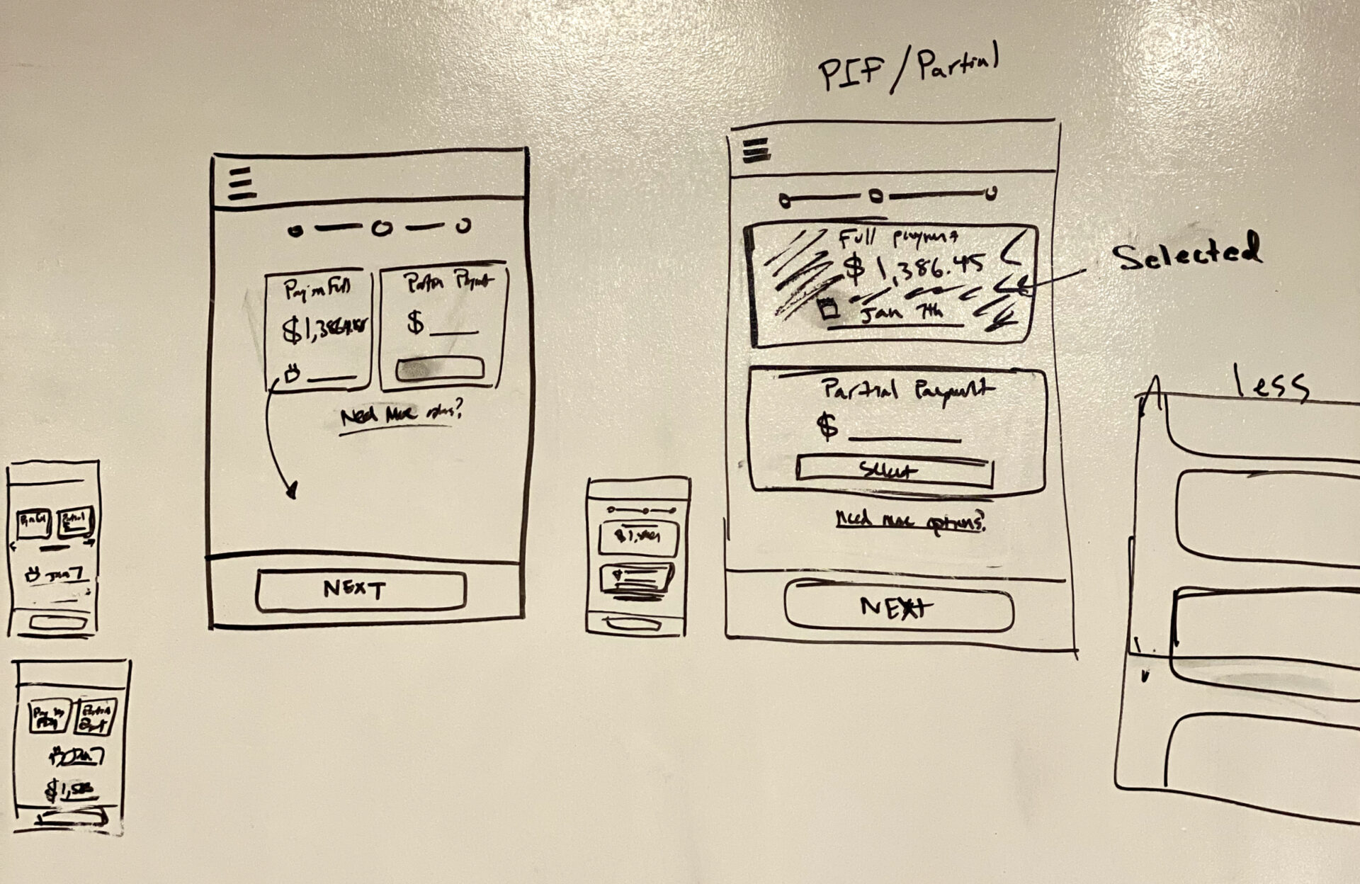
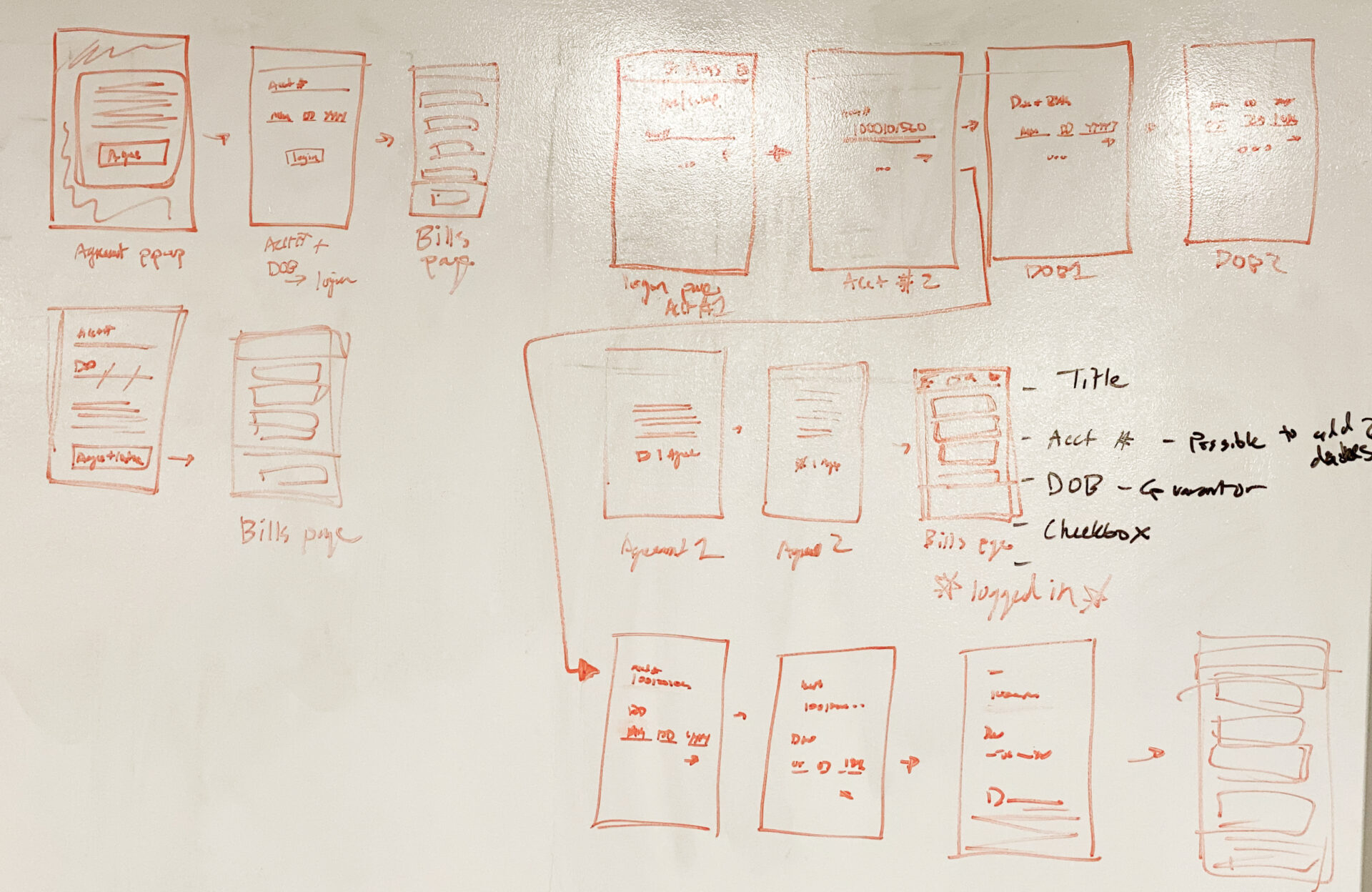
Initial exploration was done in quick white boarding sessions I facilitated with other stakeholders including product managers, engineering, and VPs.
This ensured that everyone was on the same page while the product requirements document was being formed.
Validation
I facilitated more usability testing of potential new designs. This qualitatively confirmed that the changes to the experience were removing pain points which would lead to increased completion rate.
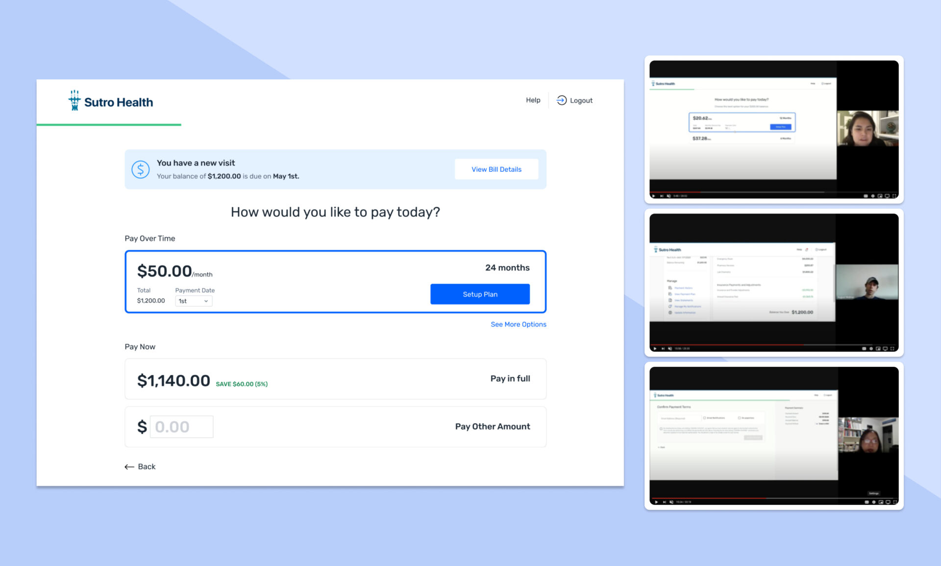
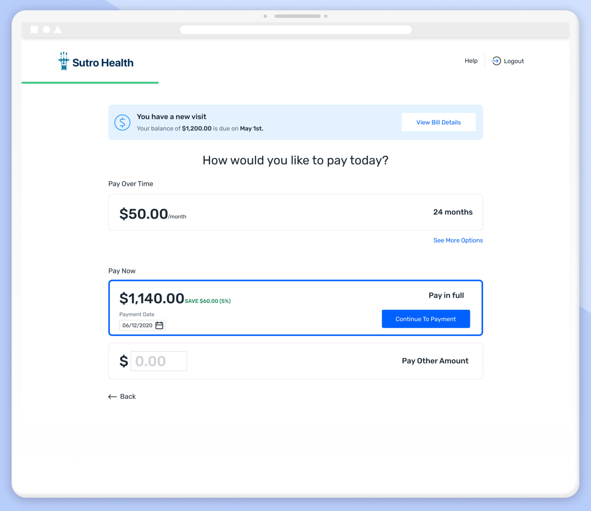
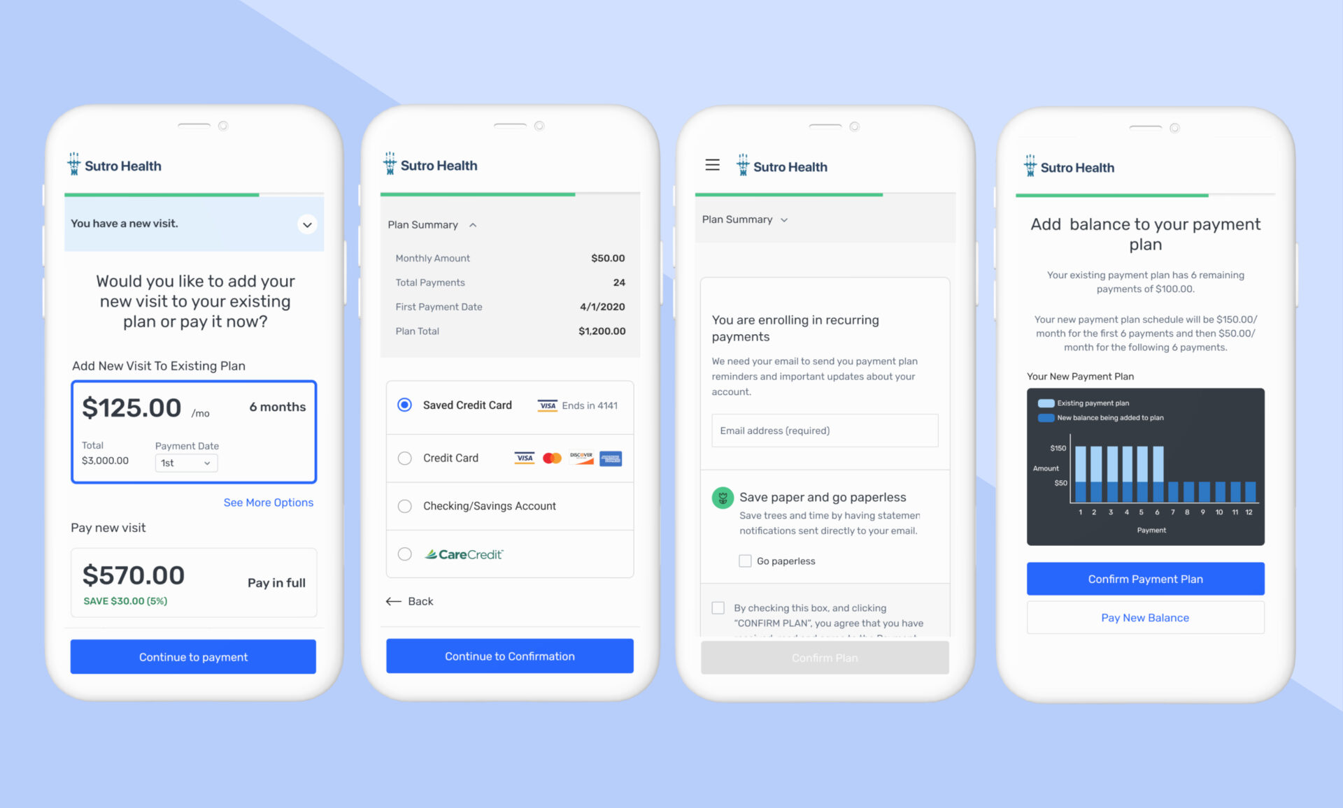
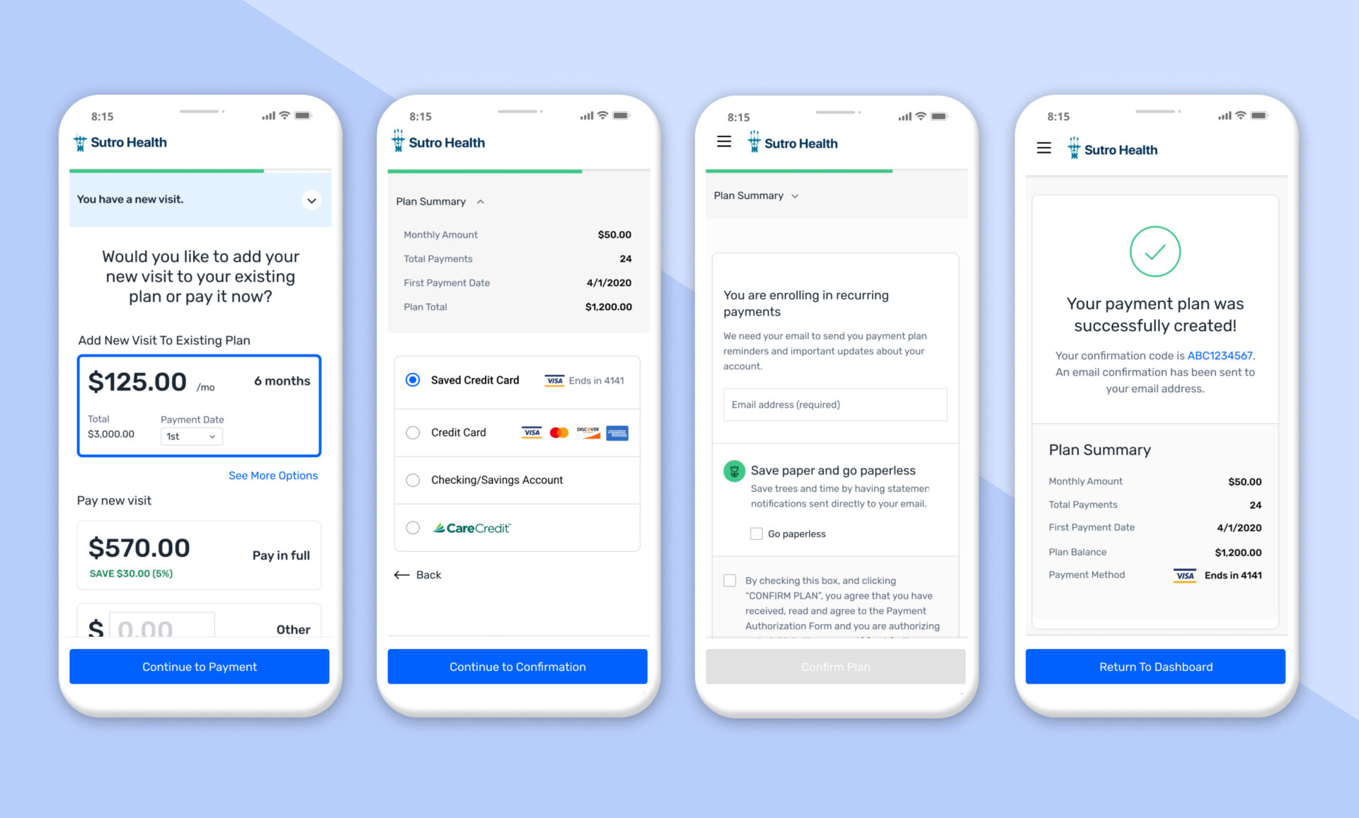
Example user Flow
The following is a recording of one of the most common user flows, from login to payment confirmation.
Results
When the new design began to be implemented with healthcare providers the positive results were almost immediately visible.
For example a smaller provider in Houstin saw their ARR increase from $100k to $233k within less than 2 months of implementation .
Conversion rate for the overall flow shot up from from 30% to 70%, meaning the redesign was a huge success.
The Net Promoter Score increased from 4 to 7